 Make it Pop
If you work in design, chances are that you have either been on the receiving end of this phrase – or maybe you have uttered it yourself.
Initially it can be greeted with skepticism (and either literal or internal eye-rolling, depending on the designer’s acting ability) from any designer in certain career stages. I have certainly scoffed at it myself.
But you know what? It’s the best creative direction you’ll hear because it is actionable. Sorry about the jargon-y word usage there, but stick with me.
What Designers Hear
They hear something akin to static-y white noise. It can often be a telltale sign of a person in a position of authority who lakes the ability to more descriptively “talk the talk”. But you know what? I realize lately that –
I Was Wrong. Or Cocky. Or Both.
Because – really – what the directive of “make it pop more” is trying to tell us can be traced to two prevailing design tenets: color usage and/or visual hierarchy.
Visual design (at least for those paid practitioners in the working world) ought to lead the viewer to an action. Add to Cart. Contact Us. Opt-In with a Fake Email. The call to action is our bread and butter. It’s success is inextricably linked to whether or not we have achieved the business requirements of the piece.
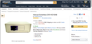
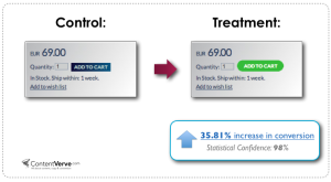
Particularly in User Experience, visual hierarchy helps distinguish the desired primary action from the secondary action. Any doubt what these online stores want us to do next?
These screenshots clearly illustrate the use of color to guide the user’s eye.
In both cases, the desired intent “pops”. You should be able to squint and still see the intended call to action whether it uses a color not used elsewhere or a button rendered with affordances like a shopping cart icon.
So, the next time someone asks you to “make it pop”, evaluate the color usage and size. And wipe that smirk off your face, unless of course you work off-site.